An expanded conversation around representation
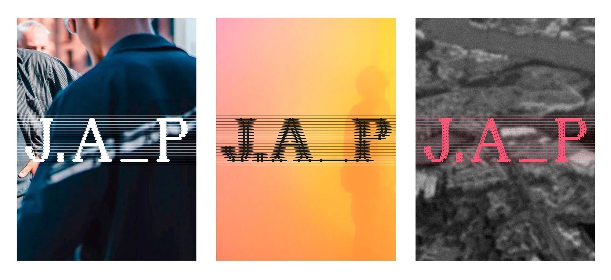
JA Projects’ new identity designed by Studio Hugo Blanzat embraces an unconventional – and difficult – approach to design, and emerges out of their collaboration on the Fashioning Masculinities exhibition at the V&A as well as extended conversations around representation, decolonial logos, and embracing the messiness that makes cities tick.
In many ways, JA Projects are both a dream and difficult client. Their list of commissions is impressive, and crosses fields of art, fashion, architecture and placemaking, with projects on the horizon including the early stages of building socially-inclusive communal housing in London. Their approach mirrors a compelling set of social values – that places should be diverse, supportive and enriching. But how do you develop a singular identity for someone who’s entire practice is about hybridity, difference and complexity? As Jayden said, “Our practice exists to make space for the multiple different identities that exist in an incredibly diverse city like London.” Hugo didn’t have an easy challenge.
Their conversation began with an open question – how could you develop a decolonial graphic identity? Hugo cites Ruben Pater's book ‘The Politics of Design: A (Not So) Global Design Manual for Visual Communication’ as a major influence in his thinking. From both of their perspectives, too often the design world had approached typography and ethnicity in cliched ways, often resulting in racist caricatures or reductive ideas of what it means to represent culture.
The process began with an examination of Jayden’s own background as a partially Turkish Cypriot Black man from Bethnal Green of dual heritage, who has built his career celebrating the multiplicity of London. But that direction didn’t fully sit right, and clarified where they wanted to take the new identity of the studio.
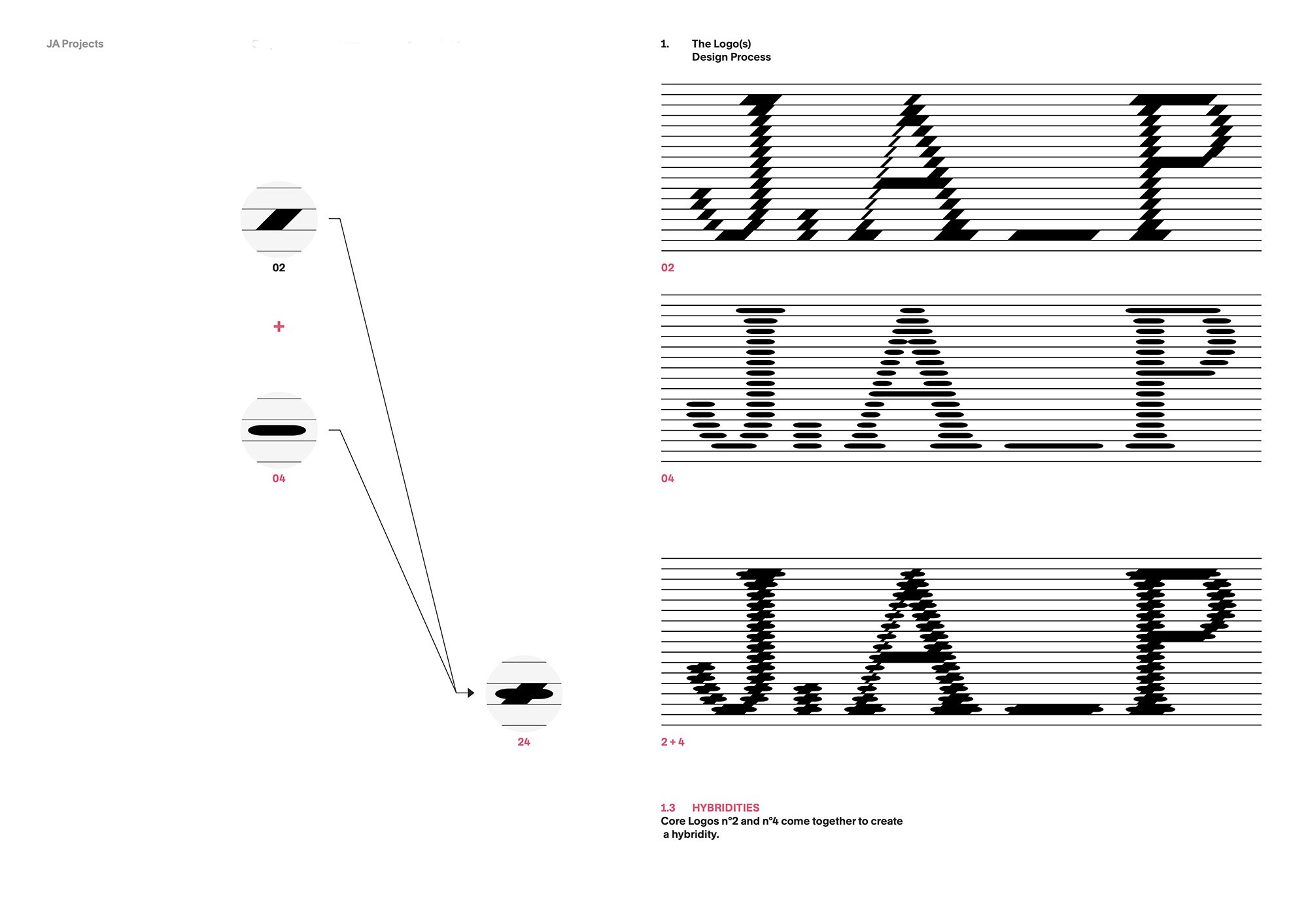
The final logo is not a static image, but an amalgamation of distinct graphic elements that come together to create a range of expressions – both contrasting and hybrid, making unusual shapes from combining conventional modules. In practical terms, this means variations of the logo are available for different contexts: an invoice, a project brief, their website. Such a flexible design approach becomes a metaphor for how identity is inherently performative and multifaceted, conveying JA Projects’ multi-cultural ethos.
Reflecting on the results, Jayden has said: “It’s bold. It’s got lines on it that shouldn't exist. It's not quite the easiest thing to put on documents. It's about honestly articulating the messy confluence of contemporary life. That’s what a hybrid culture is.”
In classic Studio Hugo Blanzat style, this wasn’t the easy road to take. Designing a system with no fixed shapes meant more work for them, and it requires an additional level of care by the client when using it, too. But this was part of the appeal for both of them. Infamously, the logos of major companies are increasingly homogeneous and generic as brands take the safe option.
An ongoing conversation
JA Projects’ original identity was developed in-house – by Jayden himself. After running the studio for a few years and with more and more projects under their belt, it felt like the right time to update their graphics to reflect their growing identity as a studio.
The two met while working on the design of the major exhibition Fashioning Masculinities at the V&A – Jayden conceived and created an immersive sensory space for the show, and he invited Studio Hugo Blanzat to work on the graphic design, where Hugo developed a bespoke typeface that evolves with the visitor journey. Jayden was hugely impressed by the ambition Hugo brought to the project. “Nowhere in the brief did it say we were going to have 400 square metres of custom printed fabric. But they went there.”
Following the success of the exhibition, Jayden knew he wanted to continue working with Hugo. Jayden explains: “What made us want to work with them? You have to follow the energy sometimes. You see people producing great work, and it’s like, OK, what else is there to think about? It's natural. It makes sense.”
A pervading sense of mutual respect followed. Jayden admired Hugo’s critically acclaimed publication Television, and was interested in going beyond a British perspective and working with a French designer. Both Jayden and Hugo share an interest in expanded approaches to culture and design, and from their initial conversations to the feedback and final design, saw the process as a means to experiment and challenge each other.


